Welcome to the Flowith Landing Page
This guide walks you through everything you’ll find on the Flowith workspace landing page, the first screen you see after logging in. Think of it as your creative launchpad.
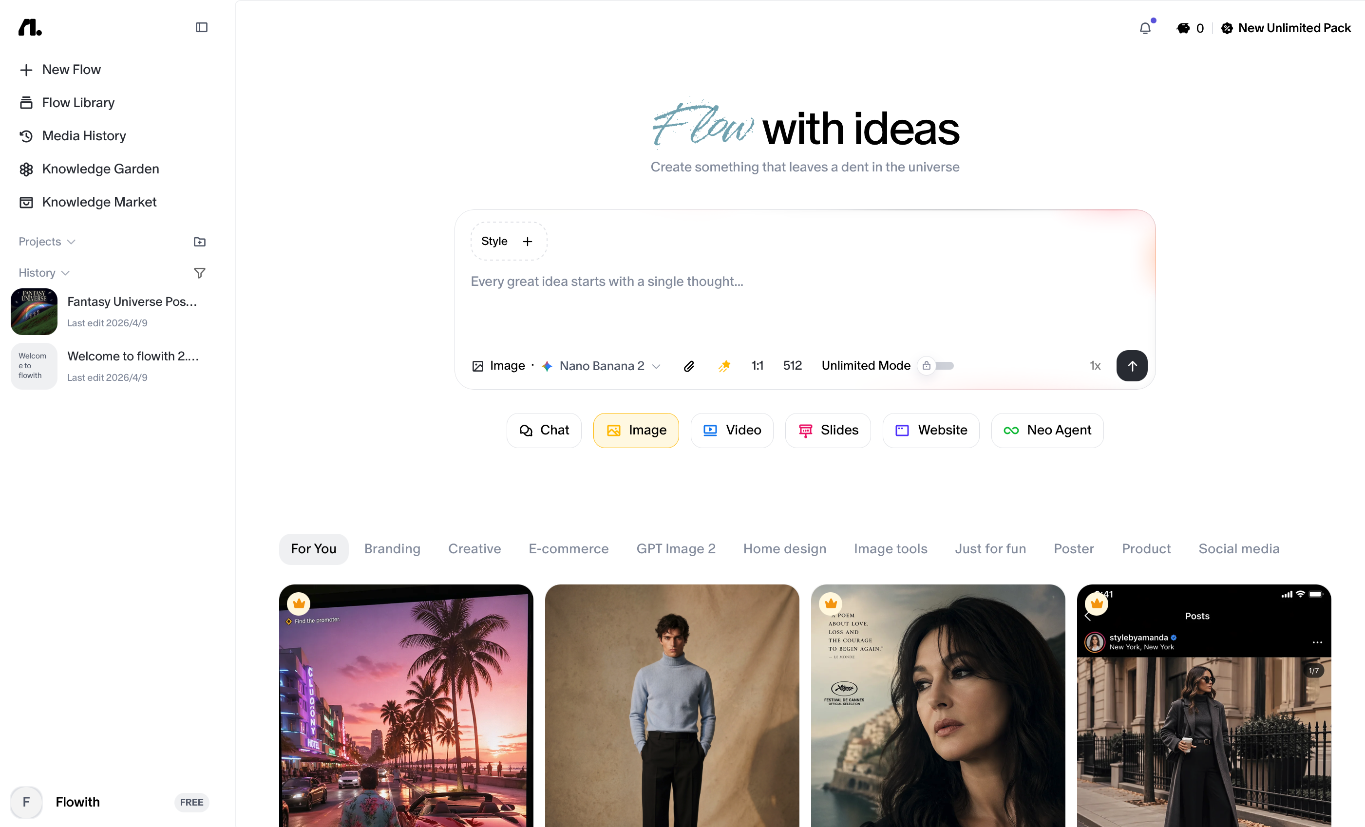
Page Layout at a Glance
The landing page uses a two-column layout:
- Left column (fixed sidebar): Navigation, Project folders, Knowledge Base, Chat History, and your account.
- Right column (main workspace): A prompt input area at the top, followed by a scrollable gallery of reusable examples and templates below.
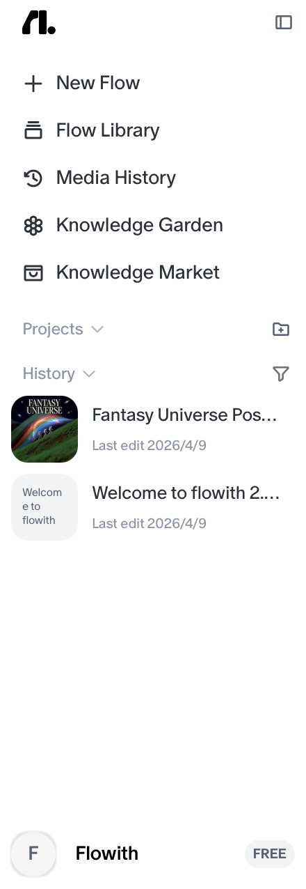
1. The Sidebar
The sidebar lives on the left side of the screen and stays fixed as you interact with the main workspace. It handles all your navigation and organization.
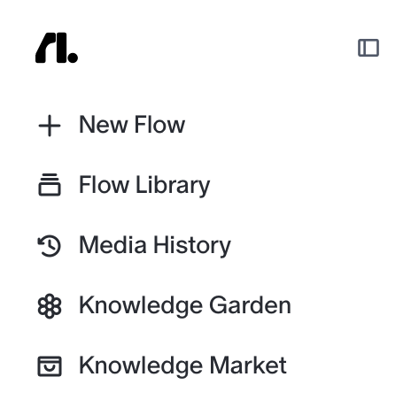
Top Controls
At the very top of the sidebar you’ll find two elements:
- The Flowith logo: a minimalist
fl.icon. Clicking it returns you to the home view. - Sidebar toggle: a small square icon next to the logo. Click it to collapse the sidebar and give your workspace more horizontal room. Click it again to bring it back.
Primary Navigation
Just below the top controls are your four main navigation buttons:
| Button | What It Does |
|---|---|
| + New Flow | Creates a brand new AI-driven workflow in a totally new canvas. |
| Flow Library | Browse and access your saved flows and projects. |
| Knowledge Garden | Manage stored information, data, and context that your flows can reference. |
| Knowledge Market | Explore a marketplace of shareable knowledge bases created by the Flowith community. |
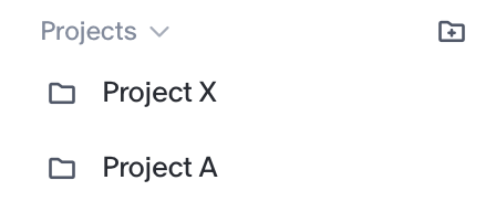
Projects
Below the navigation buttons is your Projects section. This is where all your organized workflows live.
- The section header reads “Projects” with a dropdown for switching how projects are displayed, and a New Folder icon on the right to create a new folder instantly.
- Below the header is a scrollable list of all your folders. Each folder holds related flows and files you’ve created.
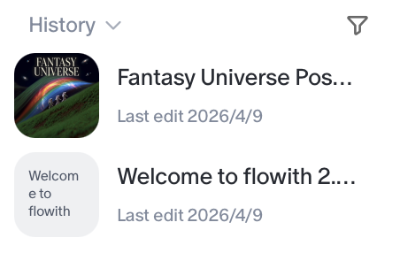
History
Below your Projects list is the History section. It shows your recent activity, a running log of flows you’ve worked on, each with a timestamp (e.g., “Last edit 5 hours ago”). Use the filter icon in the section header to narrow down the history list.
User Profile (Bottom of Sidebar)
At the very bottom of the sidebar is your account info:
- Your account name
- Your subscription tier badge (e.g.,
INFINITE)
Click this area to access account settings, usage, manage subscriptions, invite friends or report bugs.
| Button | What It Does |
|---|---|
| Upgrade Your Plan | Navigate to the pricing page and make a subscription upgrade. |
| Invite Friends | Invite friends to Flowith and check your referral rewards. |
| Settings | Check your account preferences or usage details, manage your subscription and purchase top up packs. |
| Download iOS App | Download the iOS version of Flowith. |
| Official Website | Navigate to Flowith’s official website. |
| Report Bugs | Report the bugs you encountered and get some help from support team. |
| Log out | Log out your account. |

2. The Prompt Engine (Main Entrance)
The top of the main workspace is where you start most of your creative sessions. It’s the central input hub for Flowith.
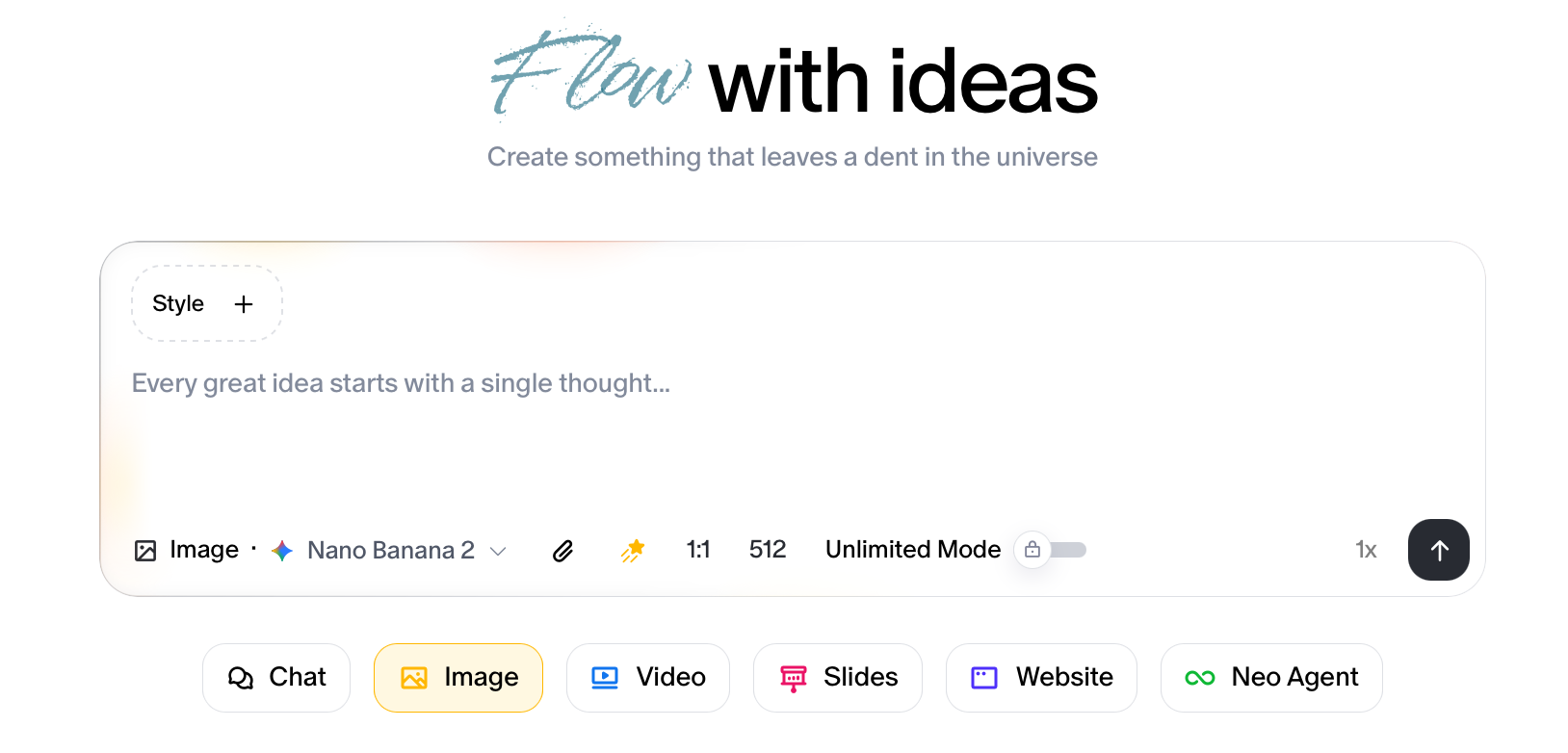
The Input Box
A large, inviting text field sits center-stage with the placeholder text:
“Every great idea starts with a single thought…”
Type your prompt here to describe what you want to create, ask a question, or give an instruction. This is the starting point for everything.
Toolbar
Running along the bottom edge of the input box is a row of controls (left to right):
| Button | What It Does |
|---|---|
| Interaction Mode | Switches between interaction modes (e.g., Chat, Image, Video, etc.). Use this to control how Flowith responds according to the output types you wish to have. |
| Model Selector | Opens a dropdown and choose which AI model powers your flow (e.g., Claude, GPT-5, etc.). |
| Attachments | Upload files, images, or documents to include in your prompt context. |
| Knowledge Base | Give modal access to the knowledge base you selected and get better outputs. |
| Online Search | Toggle internet access on or off. When enabled, Flowith can pull in live web information to supplement its responses. |
| Batch Generation | Controls how many parallel outputs Flowith generates at once. |
| Send Button | Submits your prompt and starts the flow. |
To start a flow: Type your idea into the input box, configure any toolbar options you need, and hit the Send button.
3. The Playbook
Below the prompt engine, the rest of the main workspace is filled with a masonry-style scrollable gallery of visual cards. This gallery serves as both inspiration and a quick-start library.
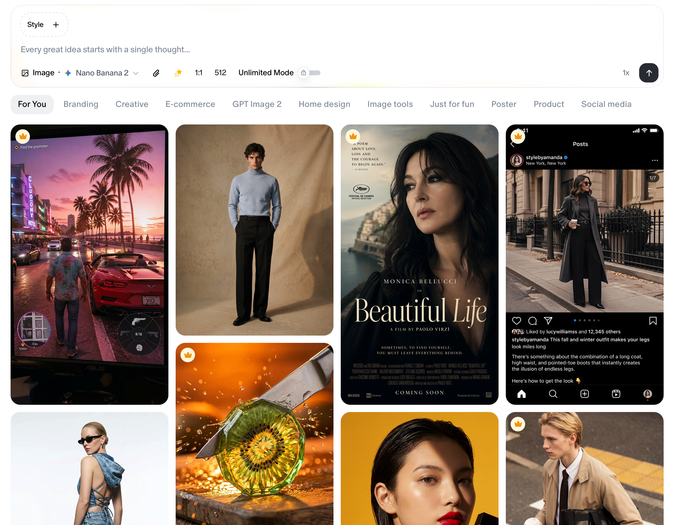
What the Cards Are
Each card is a high-quality example representing a different creative style, use case, or output type.
The gallery spans many categories: photography, illustration, video concepts, product shots, advertisements, and more. As you scroll down, more inspirations load.
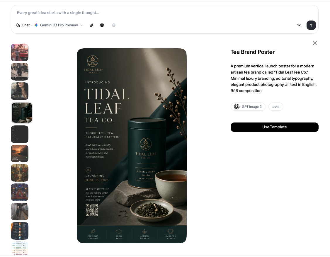
How to Use a Card
Hover over any card to reveal a Use button in the bottom-right corner of that card. Clicking Use instantly loads that example’s prompt or style into your input box, so you can use it as-is or customize it as your own starting point.
Quick Start: Your First Flow
Here’s the fastest path from landing page to your first creation:
- Type your idea into the prompt input box.
- Choose a model using the Model Selector if you have a preference.
- Toggle Web Search on if your prompt needs current information.
- Hit Send and Flowith takes it from there.
Or, if you’re looking for inspiration:
- Scroll the gallery to find a style or concept that catches your eye.
- Hover and click
Useon any card to load its prompt. - Edit or extend the loaded prompt to make it yours.
- Hit Send.
Tips
- Use folders in the Projects section to stay organized. Group related flows together as your library grows.
- The Execution Multiplier is great when you want to compare multiple AI outputs side by side. Bump it up before sending.
- Locked buttons and templates are not open to free users. Get them unlocked immediately after subscription.